VR UNIVERSE
SKILLS & TOOLS
User Testing, Wireframing, Sketch, Unity
ROLE
User Researcher, Graphic Designer
PROJECT DURATION
2017-2018 (12 mos)
CONCEPTUALIZATION——
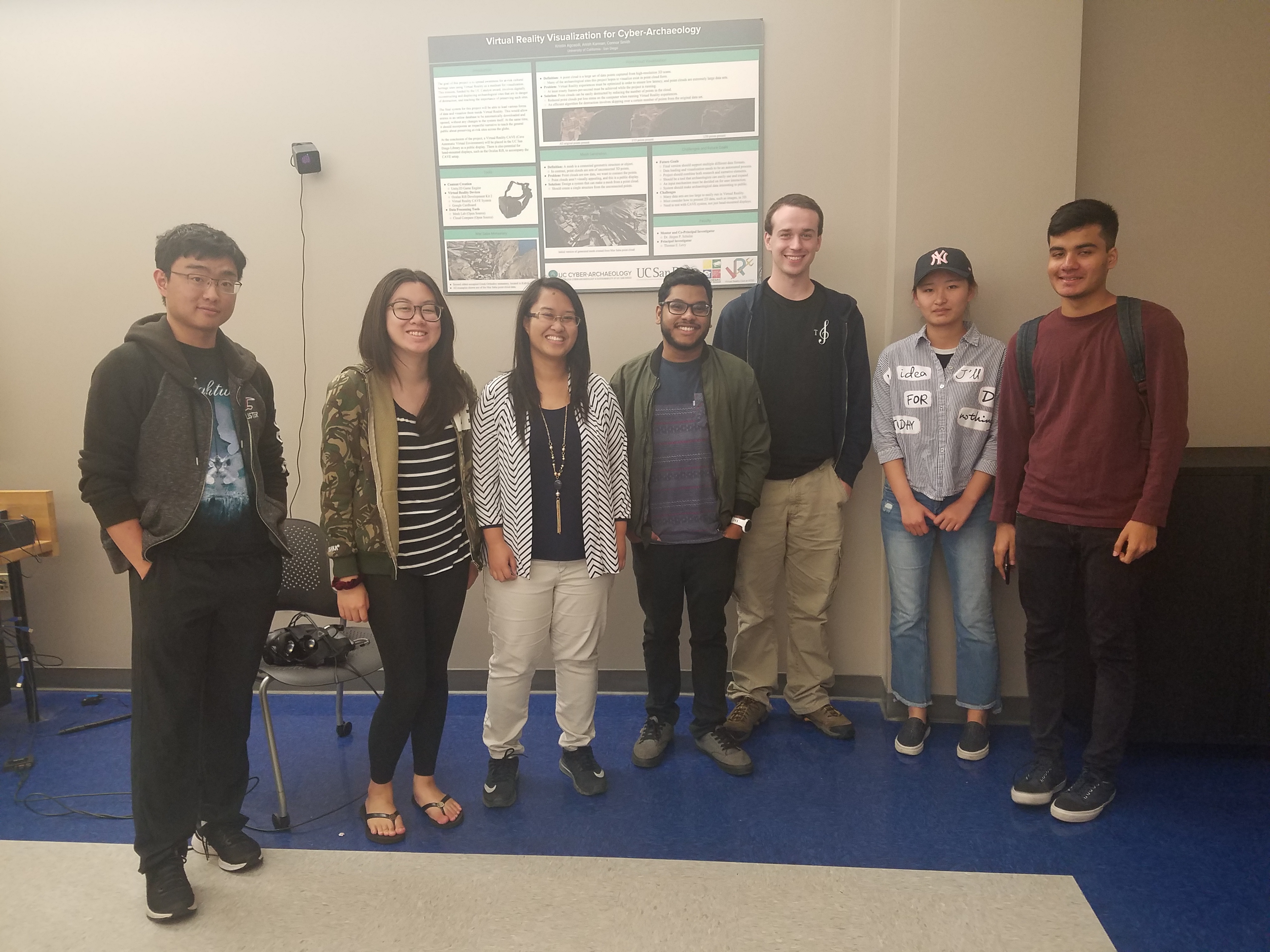
Virtual Reality Club at UCSD, currently known as Triton XR, was in the process of creating a VR application that would document the club's history of projects. Prior to the fall of 2017, a student team had already began the process of creating a space-themed environment, where each of the planets in space would represent a project on the HTC Vive. The student team included 9 other individuals: Kristin Agcaoili, Prasanth Abraham, Xinyi He, Dana Kimball, Xin Li, Henry Narabe, Subhankar Panda, Rui Ren, and Virginia Xu. While creating this application, the team realized they had not properly addressed the anticipated growth of this project since it would eventually accumulate many student creations. They also discovered that the current tutorial the environment offers failed to be of any use towards first-time VR users.
When I joined the project, I interviewed team and first-time VR users and ultimately funneled these issues into this main need: For first-time VR users, it can be difficult to navigate a virtual reality application because it can be very overwhelming in a multitude of ways. From motion sickness to the unfamiliarity with VR consoles, there's a lot that a first-timer has to face.
DESIGNING THE TUTORIAL
NEEDFINDING
Prior to joining the project, the team had a static window in the virtual environment depicting a simple diagram of the HTC Vive's controls. However, after multiple demos at the organization's showcase, the team members realized that very few actually noticed the static window since it was confined to one area in the environment and there was no way of informing the user that it was there in the first place. Because of this discovery, the team wanted to implement a tutorial system that was user-friendly and engaging enough so that a user can use VR Universe with little aid.
FIRST ITERATION
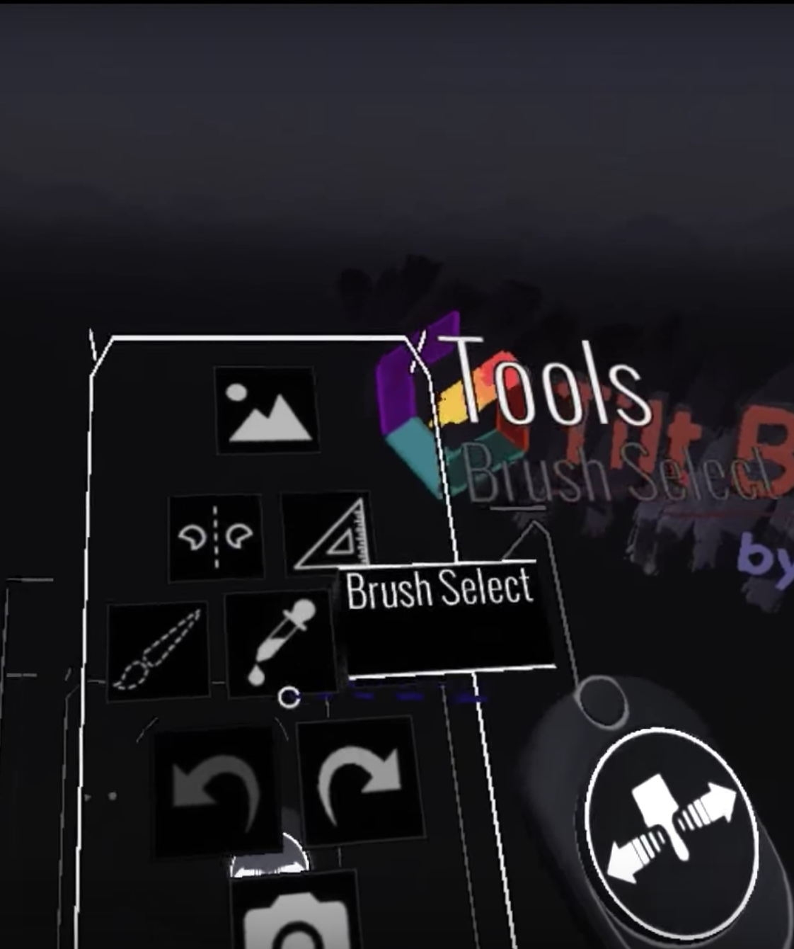
Initially, I thought that simply attaching labels to the virtual model of the controller itself in the enviironment would serve to solve this problem. I studied other successful VR applications, such as TiltBrush, because I thought that TiltBrush's massive multi-functionality could inform me to make better design decisions. I made simple text labels in Unity that indicated the "pointer", our "year selection" trackpad, and the "quit" button. However, that immediately cause a lot of problems. Firstly, there wasn't any explanation informing the user how to use the "year selection" trackpad (whether it was to press left/right or up/down). Secondly, the "quit" button was adjacent to the Steam button on the HTC Vive and had the same feel and shape, so users often pressed the wrong one.
BRAINSTORMING SECOND ITERATION
I immediately went back to the drawing board. I know that virtual reality is hard to pick up on for those who have never experienced before and 2D visuals such as diagrams or labels don't offer enough information. Hence, I proceeded to think of step-by-step tutorials that compels the user to familiarize with our application before actually using it.

PROTOTYPING SECOND ITERATION + USER TESTING PART 1
In Unity, I created text labels that would appear in sequential order and disappear after the instruction on the label was executed.
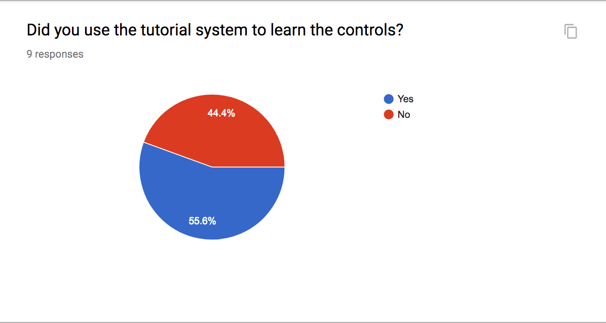
In the following quarter demo, we had students try out the newly implemented tutorial system. Unfortunately, in our student survey, only half used the tutorial system. I wasn't sure as to what the exact reason was for each given case, but while observing the demos, I noticed that very few actually followed the labeled instructions all the way through because they weren't looking at their controllers at all; they were more focused on the actual environment.
PROTOTYPING THIRD ITERATION + USER TESTING PART 2
This brought me back to the original issue: how can I inform the user that a tutorial system exists for them to use?
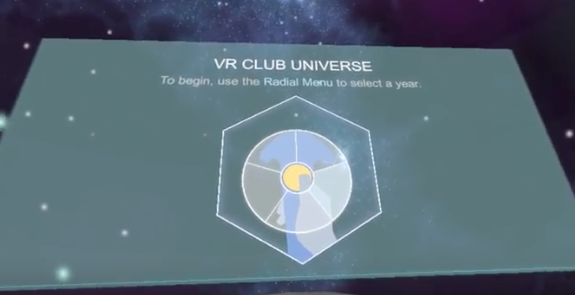
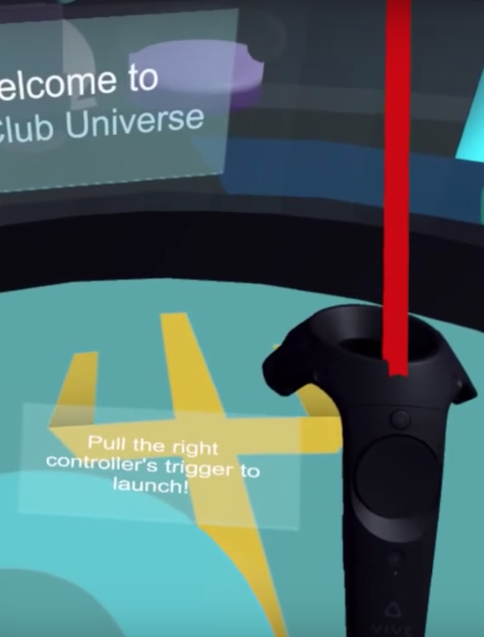
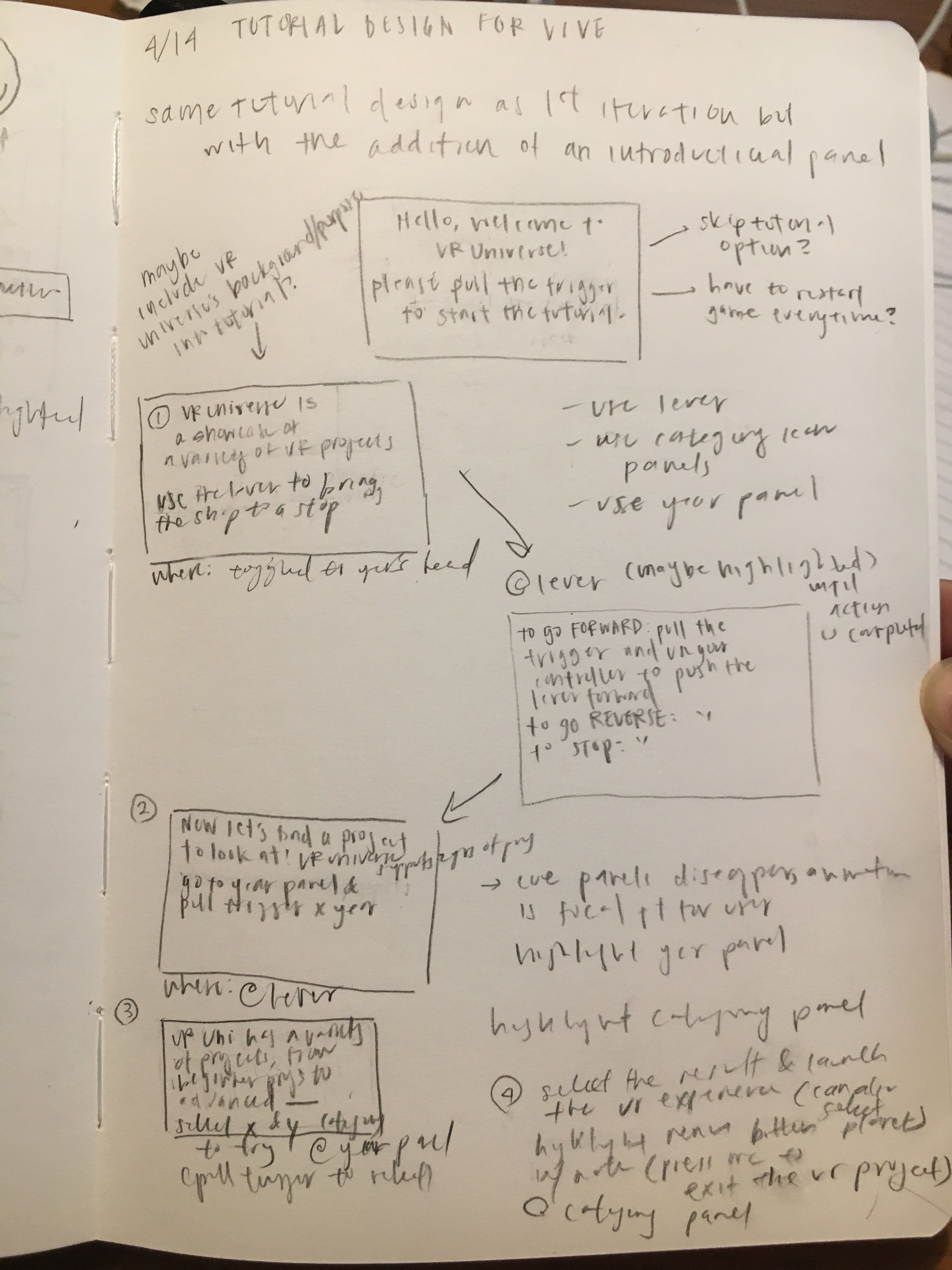
The way I addressed this issue was by having the tutorial toggle to the head when the the user enters the environment. By having it in the viewpoint of the user, the user will automatically see it regardless of where they are standing within the environment because it's no longer stuck at a fixed point. No matter where they turn, the user will definitely see the tutorial's welcome panel.
I also fleshed out the tutorial so that our instructions could gently ease first-time VR users into the VR Universe. In the introduction panel, we welcome the user and provide instructions on how to proceed in the tutorial. I was also considering if I should include a skip option to provde more flexibility and freedom in the case that the user was already familiar with how our project worked.
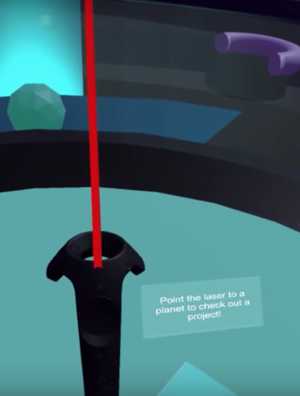
The tutorial would then walk through each of our features through multi-step panels: the filter, the year panel, and the lever. For each feature, there were brief instructions on how to use the Vive's console to actually utilize each feature. The user was taught how to select categories in the filter, switch between years, and maneuver the lever to control the speed of the spaceship within the VR universe. Each panel appeared for around 5-7 seconds then it would disappear and the next tutorial window would reappear at the specific location where the next set of instructions would take place.
We finally conclude the tutorial by eventually having the user explore a project of their choosing.
This brought me back to the original issue: how can I inform the user that a tutorial system exists for them to use?
The way I addressed this issue was by having the tutorial toggle to the head when the the user enters the environment. By having it in the viewpoint of the user, the user will automatically see it regardless of where they are standing within the environment because it's no longer stuck at a fixed point. No matter where they turn, the user will definitely see the tutorial's welcome panel.
I also fleshed out the tutorial so that our instructions could gently ease first-time VR users into the VR Universe. In the introduction panel, we welcome the user and provide instructions on how to proceed in the tutorial. I was also considering if I should include a skip option to provde more flexibility and freedom in the case that the user was already familiar with how our project worked.
The tutorial would then walk through each of our features through multi-step panels: the filter, the year panel, and the lever. For each feature, there were brief instructions on how to use the Vive's console to actually utilize each feature. The user was taught how to select categories in the filter, switch between years, and maneuver the lever to control the speed of the spaceship within the VR universe. Each panel appeared for around 5-7 seconds then it would disappear and the next tutorial window would reappear at the specific location where the next set of instructions would take place.
We finally conclude the tutorial by eventually having the user explore a project of their choosing.
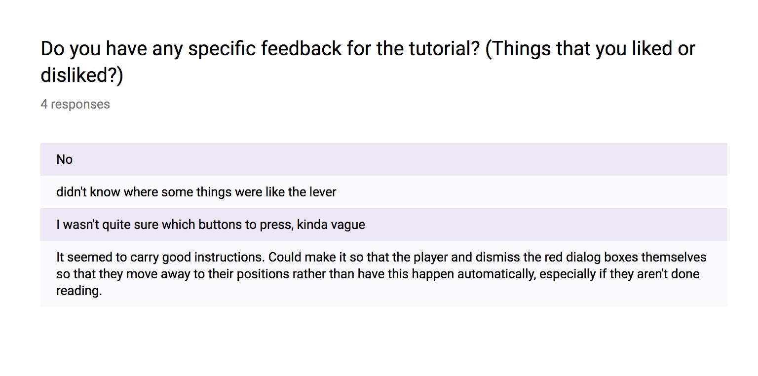
During user testing, one user commented that they would prefer dismissing the tutorial windows themselves since the pacing of tutorial is automatic. One other user also noted that they didn't know where the lever was which is an understandable issue since the environment involves the user looking in all directions, something that first-timers might not be aware of.
When I refined the tutorial the final time, I took these things into consideration. I changed the tutorial so that the window would appear for as long as they wanted and that dismiss and skip options were included.
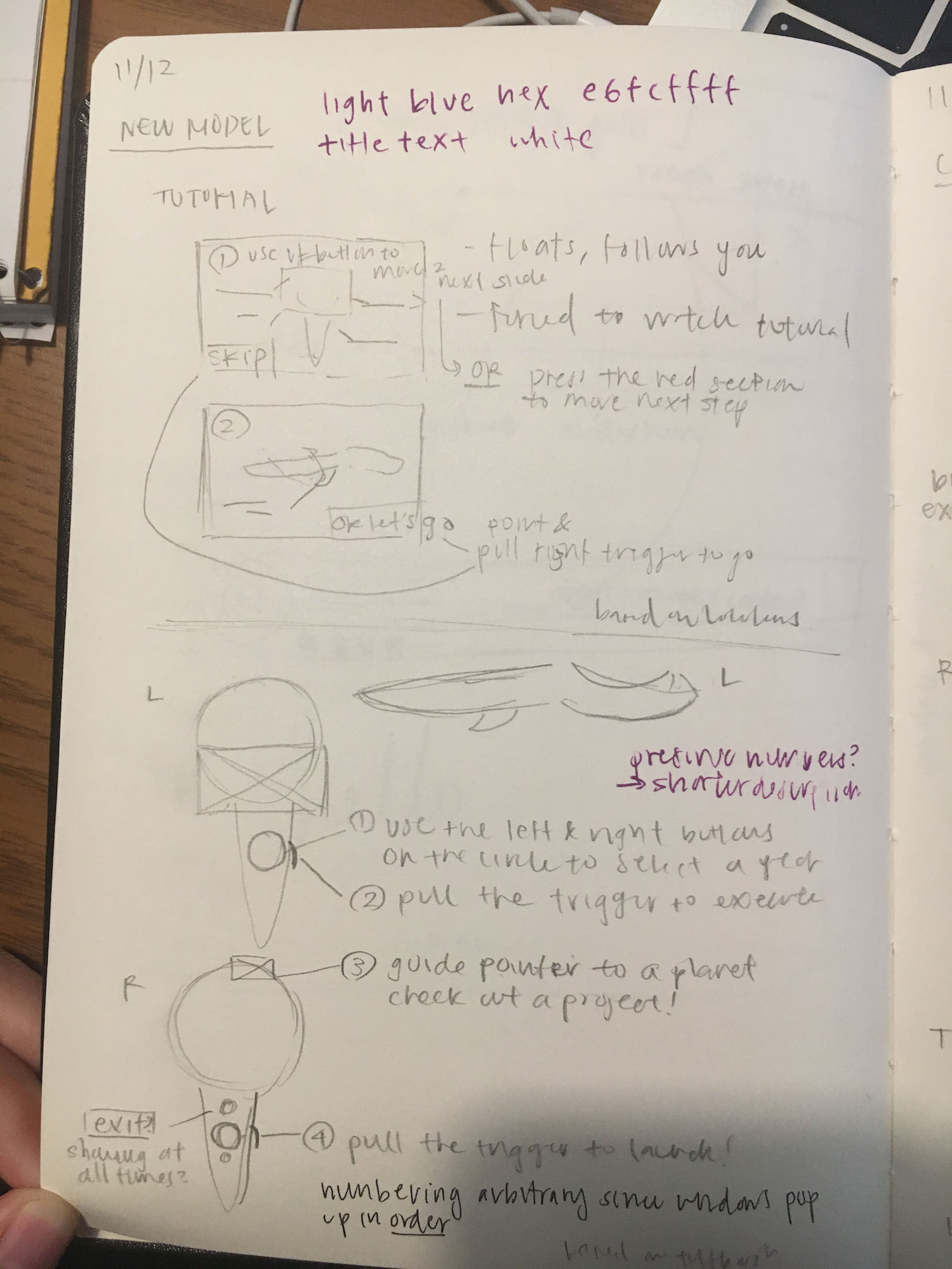
PROTOTYPING FINAL ITERATION
The tutorial graphic redesigned to highlight the specific parts of the HTC Vive console that correlate with our controls.
When the tutorial is dismissed or the task is completed, it floats to the next location where the next set of instructions occur.
The user also has the "skip" option, which exits the user from the tutorial, and the "next tutorial" option, to automatically proceed to the next step.
In our final iteration, the tutorial consists of the user having to go over a series of task that familiarizes the user with the multiple features that exist in VR Universe just like the previous iteration. However, besides the set of instructions on each tutorial panel, I also made sure to include "dismiss", "next tutorial", and "skip" options. This was intentionally designed so that rather having the tutorial run on its own while pausing every 5 seconds, each user can have the flexibility and the freedom to go through the tutorial at his or her own pace. With these changes, I wanted users to learn mentally but to be guided physically in order to take advantage of the physical capabilities in VR.
TAKEAWAYS
Going into this project last year, I was still pretty unfamiliar with the design process. I had never really made a paper prototype or a proper hi-fidelity one on Sketch. I wasn't aware of the proper protocol for user testing and I was a complete novice to using Unity. Virtual reality was and still is such a novelty to me and this project was one the most exciting opportunities I got to participate so far. Looking back on it now, I would have changed a lot of things such as removing numerical rating questions and taken more time with my user testing debriefs with proper follow-up questions. I would have liked to done more iterations but prototyping for virtual reality is a lot different that anything I ever experienced because there's a lot of unaccounted factors (such as physical depth and visual angles) in a virtual 3D environment that you wouldn't really notice when developing an application that is 2D. I realized I made (and still make) a lot of assumptions in design and that it is with patience in tackling the iterative design process do I slowly catch myself making these assumptions and grow to be a more open-minded designer.
DESIGNING THE SEARCH FILTER
NEEDFINDING
The search filter system was suggested by one team member because VR Universe would eventually store a very large database of projects which would make it increasingly difficult to navigate. Having the search filter would not only make it for VR Club members find specific projects, it could also seem less overwhelming to students who visit the club's quarter showcases and have never engaged with virtual reality before.
FIRST ITERATION
INSPIRATION
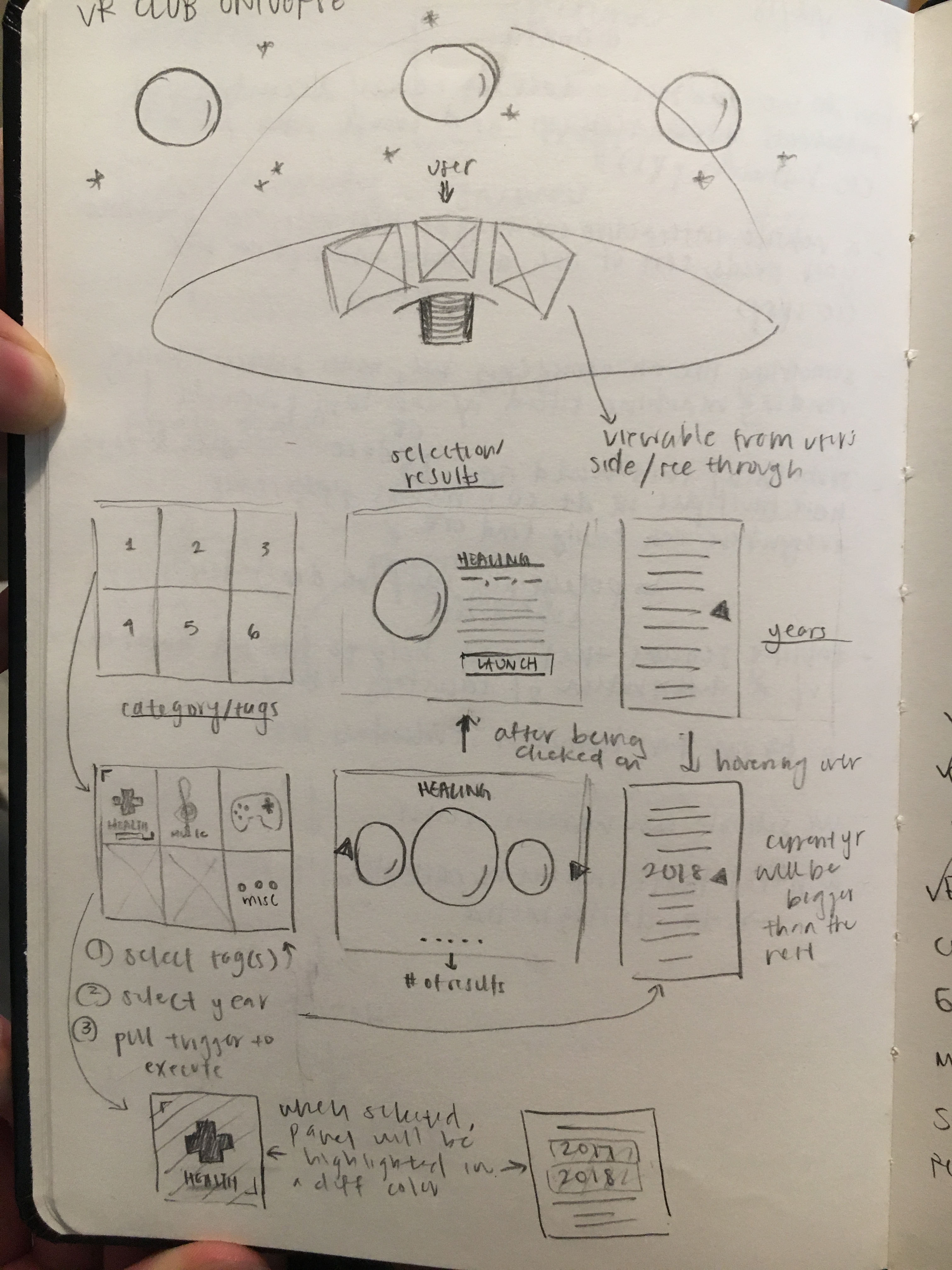
Initially, another project team member and I wanted our search filter system to be like a spaceship control panel since we were traveling in the "VR Universe." We were also simultaneously modifiying the look of the main environment to look like the interior of a spaceship so we wanted to continue to have that aesthetic throughout all our features.
THE DESIGN
Each VR project could be sorted by its category and the year it was made so we planned 3 side-by-side panels. The left most panel from the user's perspective would be a panel of all the categories for the different types of VR projects in the universe. The right most panel would display a scroll bar of the years chronologically from top to bottom. The middle panel would display the results of the search filters depending on the user's selection of the year and the categories he or she chose.
In our first iteration, we thought that the search results panel could display the corresponding planet paired with the project title and its description along with its associated category tags. We would attach a launch button so that the user can directly navigate to the planet without physically searching for it. For the years panel, we simply listed the years in chronological order with an arrow pointing at the year that was currently selected. For the category panel, we focused on just having a text button for each category that the user could physically select, similar to the filtering functionality on e-commerce websites.
SECOND ITERATION
REDESIGNING AND ADJUSTING
After some discussion with the rest of team, we decided to make some subtle changes in terms of the user interface in order to make it more intuitive for users to pick up on how to use the search filter system easily.
The idea behind our first iteration for the results panel was thought to be better suited as a pop-up modal for all the planets when a user freely explores the universe without via the search filter system. Another caveat we realize is that our filter can still in result in multiple projects because many VR projects were educational games so our first iteration wouldn't be too helpful since it could only display one project. I suggested another idea where the search filter would populate the results panel with all the planets that matched its search and using a similar scrolling functionality where you can see all the planets on a dial but the one you're currently viewing is magnified in size.
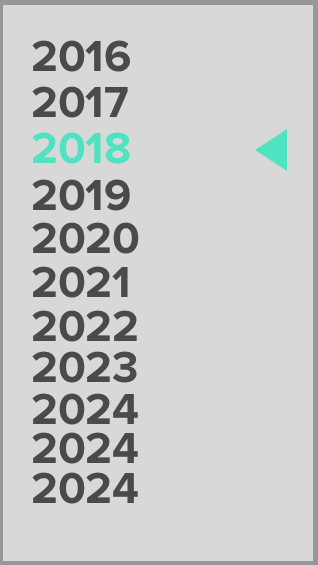
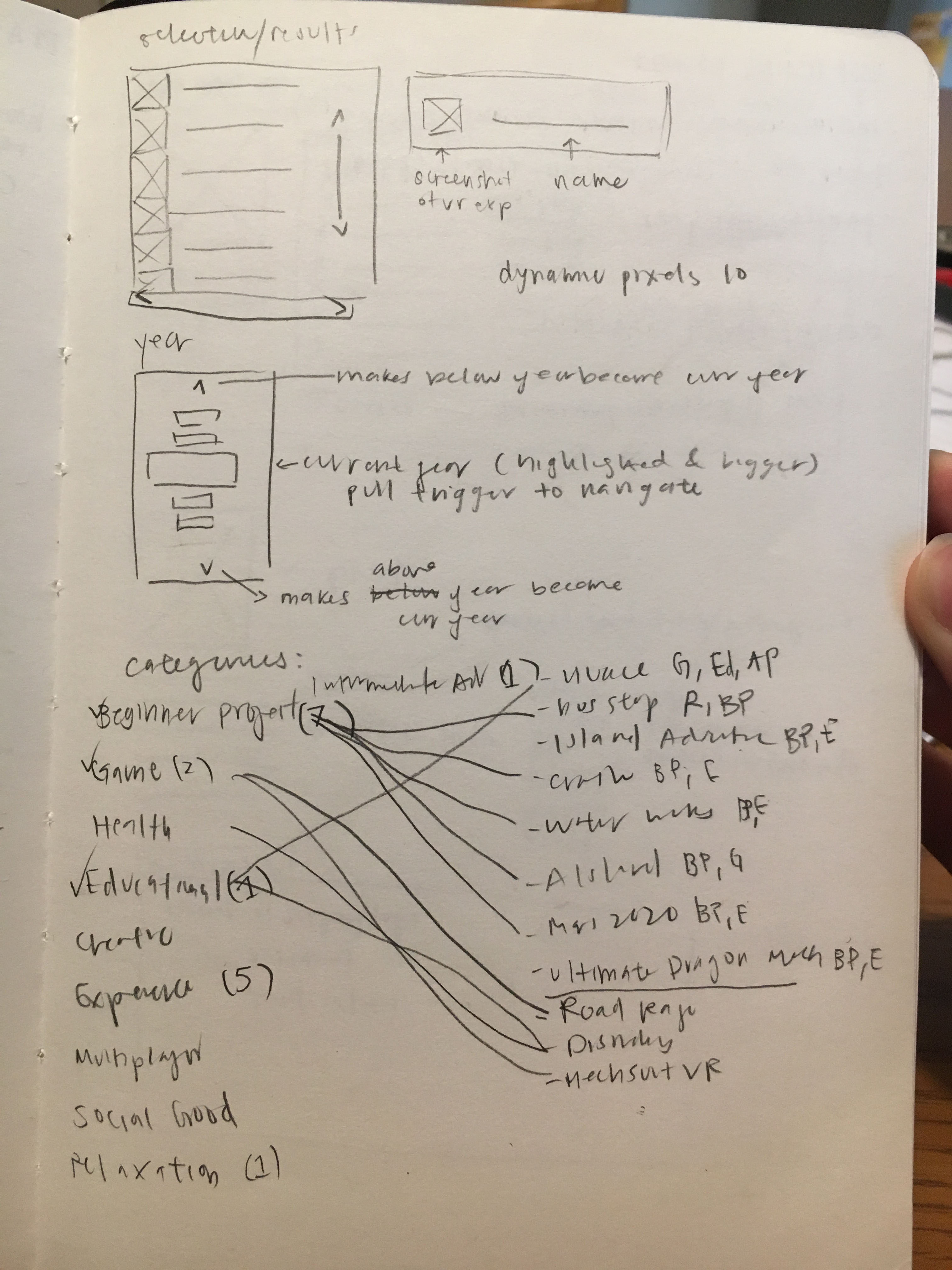
For the years panel, we improved its usability by making the current year that was selected highlight in color so it would stand out visually apart from the other years to the user.
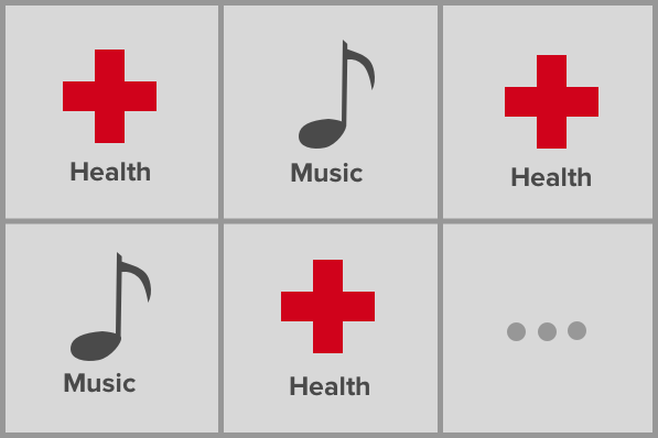
For the category panel, we decided to make icons for each of the individual categories to improve readability and be a better visual scanning aid. We listed out each of the possible categories from the current roster of VR projects and built the categories around those.
For our results panel, we decided to go with a user interface that would populate the results panel with the results matched from the search filtering. If there were many matches, the user could use the scrollbar to scroll up and down.
FINAL ITERATION
POLISHING
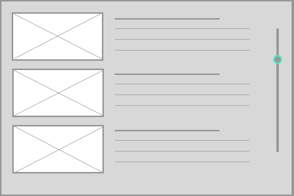
Due to the pressure of our deadline to have it ready by spring of 2018, we couldn't execute the scrolling concept for our results panel since we had limited time and it was technically challenging. Hence, we decided to stick with a stacked list of responsive modals where the user can scroll the bar by dragging and clicking to view all the results that came up. In each modal, there would be a thumbnail of the project's physical environment and its profile (the project title, name of the creators, and the category tags). When the user clicks on any of results, then the pop-up modal from the first iteration would expand to include the project description along with the profile.
For our years panel, we decided to remove the single arrow pointing to the current year selection and replace it with interactive up and down arrows to allow the user to scroll through the list.
For our categories panel, the project lead and I spent time generating a list of categories based on our current pool of projects. I designed icons for each category to make them easier to visually identify.
For our search results panel, we populated the panel with results that matched according to the search in chronological order.
TAKEAWAYS
Going into this project last year, I was still pretty unfamiliar with the design process. I had never really made a paper prototype or a proper hi-fidelity one on Sketch. I wasn't aware of the proper protocol for user testing and I was complete novice to using Unity. Virtual reality was and still is such a novelty to me and this project was one the most exciting opportunities I got to participate so far. As part of my user testing, I was able to play around with multiple student creations in virtual reality which was really exciting! You feel empowered as a designer seeing how your own peers are innovating in such diverse ways. Whether it's applications for recreation, education, or innovation, VR Universe is a crucial part of preserving Triton XR's history as an innovative student organization.Looking back on it now, I would have changed a lot of things such as removing numerical rating questions and taken more time with my user testing debriefs with proper follow-up questions. I would have liked to done more iterations but prototyping for virtual reality is a lot different that anything I ever experienced because there's a lot of unaccounted factors (such as physical depth and visual angles) in a virtual 3D environment that you wouldn't really notice when developing an application that is 2D. I realized I made (and still make) a lot of assumptions in design and that it is with patience in tackling the iterative design process do I slowly catch myself making these assumptions and grow to be a more open-minded designer.