DESIGNING FOCUS
NEEDFINDING
In the COGS 120 Interaction Design course, there were three main themes that students can choose to focus on. My team chose to focus on "enhancing health." We selected this theme because we noticed that a lot of students rapidly fell ill leading up to midterms. During our needfinding process, we chose to observe people as they tried to recover from being ill. We particularly focused on the student population since that seemed to be the most applicable and relatable demographic and watched as students studied or completed homework.
We observed and interview three different people as they tried to study or do their homework and came up with a list of insights. For example,
- Unwell student needs motivation to continue productivity while fatigued.
- Unwell student needs an easy way to know the severity and strain of their illness so they can plan their life according to their recovery pattern.
- Unwell student needs a way to remember what drugs best worked for them, including side effects.
STORYBOARDING
Throughout all of the interviews during the needfinding process, we witnessed many challenges that students have to face when they are sick during a long season of midterms. From ingesting all kinds of medicine to constantly having to sneeze, drink water, or clear one's throat while working, we noticed how easily a student's productivity could be disturbed while being ill. Using these insights, we funneled our focus on improving productivity and came up with our problem statement:
Students don't have time to adopt healthy habits and when they get sick, their productivity is stunted.
We created a storyboard about a student named Teegan to illustrate our user need in a relevant and applicable context.
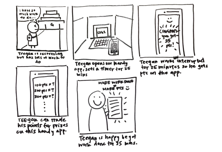
We wanted to convey that Teegan is a sick student that is behind on schoolwork. It was important for us to highlight that Teegan was successful in being productive through the use of our study timer application. Teegan indicates that he is happy because not only he did manage to get his work done, he earned points for a completed study session that he can use to exchange for rewards in the app's shop.
PAPER PROTOTYPING
We also created an interactive paper prototype to understand the strengths and weaknesses of our current user interface. We worked with other students in class to conduct heuristic evaluations on our paper prototype using Jakob Nielsen usability heuristics.
After conducting our heuristic evaluation, we realized we had to make several changes under different heuristics for our timer study application. Here are some of the noted changes:
- Having an email confirmation dialog box pop-up to inform user that the app is aware of the user's purchase
- Displaying an estimate of points when user is setting the duration for their next study session so that they know how many points they will potentially earn
Show system status
- Creating a history of past point earnings and study sessions to users can use it as a reference for future study sessions
Control & Freedom
- Including a dialog box that confirms with user of their purchase to ensure user doesn't accidentally purchase a reward they didn't intend to buy
Error Prevention
- Including a dialog box indicating unfinished timer to inform user that their study session was interrupted and they won't earn the points for that productivity session
- Adding a "forget password" option so that users can recover their account if they forget their password
Recognize, diagnose, & recover from errors
During the course of the heuristic evaluation, my team came to the conclusion that it was best to stick with a desktop user interface instead of a mobile one. The main reason we chose to stick with the desktop version of our web application is because one of the main core functionalities in our application is being able to track when a user is distracted: by clicking out of the current window and going to another window or tab. Since most people work from a desktop or a laptop, and our application requires the user to stay focused on Focus, we thought it was best to not opt for mobile.
WIREFRAMING
While keeping note of the insights gained from our heuristic evaluation, I proceeded to wireframe our prototypes. Using Sketch, I made two simple, black and white wirefames our home page and timer page to convey the general user interface and display of our core functionality.


HI-FIDELITY PROTOTYPING
Initially, I believed our wireframe would be of some resemblance to our eventual final product but as we approached the user testing phase, we quickly went through many more iterations of our user interface which dynamically changed the appearance and user experience of our application. We repeatedly polished and refined and incorporated new features that we didn't originally anticipate.

As displayed in the iterations above, we rearranged the elements on our navigation bar as well as incorporated rotating inspirational quotes that will fade in and out at the bottom of the home page. We also added a settings and profile page for help and documentation that is accessed through the dropdown menu in the navigational bar. With each iteration, we were able to slowly realize our wireframe into the finished product we had in mind.
USER TESTING
My favorite part of the design process is user testing because it's always refreshing to listen to other people's feedback and see how their mental model differed from mine. For our COGS 120 course, we had to conduct several user tests on our target demographic and utilize their suggestions and comments to redesign a core feature of our application for qualitative A/B testing. My teammates and I used this opportunity to create a formal user testing protocol which composed of:
- Verbal script for each role in the user testing session (Task Guidance, Observer, Interviewer)
- Screen and audio recording materials
- Debrief interview
During the actual user testing process we had each user
- Begin from the login page and proceed to create account with our application
- Create a study session for 1 minute and purchase a reward from the shop that would change the appearance of the app
- Change the appearance of the app back to its default settings
In our observations, we noticed that users didn't notice that the arrows used to adjust the timer were present and could help set the time. The main reason is because next to the timer we had presets of +/- 15 and 30 minutes and due to its bright green and red colors, people's attention were immediately directed to that. For example, one user during our user testing session selected the +30 min preset and then proceeded to press the "down" arrow on the minutes 29 times to set the timer for a 1 minute study session. In preparation for our qualitative A/B testing we took note of this breakdown and made it the focus of our redesign.
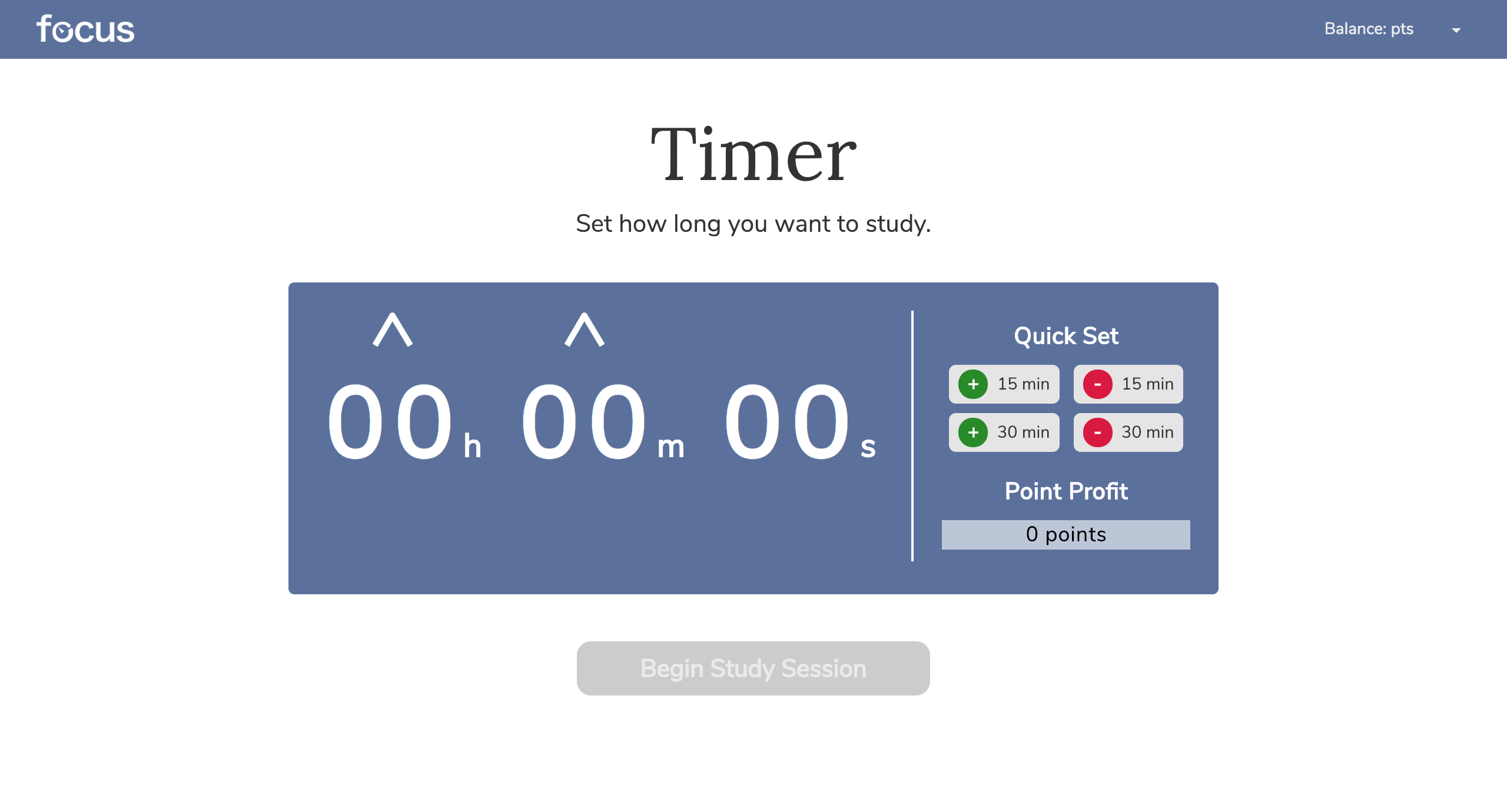
Above is the timer user interface that users saw during the user testing session. The presets for adding 15 or 30 mins were in bright green while subtracting 15 or 30 mins were in red. This was version "A" for the A/B testing.
Above is the timer user interface that we redesigned due to the breakdowns that we noticed during initial user testing trials. We animated the arrows to make them bounce to make them more noticable and eye-catching and matched the preset buttons to the overall color scheme. This was our version "B."
However, during our qualitative A/B testing, most people couldn't distinguish an immediate difference between our version "A" and "B". Several people still hovered over the presets first when trying to set the timer but after pointing out the newly added animations, people commented that they did find it somewhat useful because it definitely drew their attention. Ultimately, we kept both of our changes since the animated arrows proved to be less plain than before and the muted colors helped the presets to be less eye-catching.
FINAL DESIGN
Here is the polished final design of Focus, our desktop web application.

TAKEAWAYS
Trying to prioritize your responsibilities as a student while tackling sickness is incredibly tough, especially in college. The workload continues to pile on regardless if you're actually recovering. My team really wanted to hone in on this struggle because at the start of this project, we were all sick. We personally felt how mentally and physically challenging it was to attempt at getting anything accomplished yet be frustrated because you're physically not well enough to be productive and work hard. We can't make our bodies recover as quickly as we would like but at least we can tackle and readjust our work ethic during those difficult times. We designed Focus with this hope in mind.
Looking back on this now, I really enjoyed in having hand in every part of the design process even if I'm weaker in certain areas compared to others. As the UX Designer and the User Testing Specialist, I really enjoyed composing wireframes and developing the scripts and protocol for user testing. I enjoy learning new insights and grasping the differences between a designer's mental model and a user's mental model.
Going into the future, I know that our rewards in the shop aren't very strong incentives which weaken the usability of our application. Another caveat is that many students use their computers to study, whether it's to scroll through notes or to watch podcasts. Hence, switching among tabs on a browser is very necessary and shouldn't count against the user while they are trying to earn points for a productivity session. Given more time, we would have liked to implement a way to track websites that students often go to that would serve as distractions and have Focus track these sites so that when a user does navigate away, they can cancel a productivity session under the appropriate circumstances.